Showing posts with label Paint. Show all posts

Thursday, April 17, 2014

DIY Striped Walls

If you've read some of my most recent posts, you will know that I am in the process of moving to my new apartment. With that, I will be repainting some of the rooms in the apartment, and am planning on painting an accent wall in the living room as well.

As a result of this, I thought it would be fitting to write today's post about how to paint your very own striped accent wall, and also, how to decide on the direction of the stripes, and which wall to place them on.


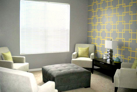
First thing's first; pick a wall. If you pick an end wall, it can trick your eyes, making a long room seem more grounded and equally proportioned. the opposite effect can be achieved by painting a front or back wall.

 Now, choose the direction that your stripes will run. Painting vertical stripes can make a room with a low ceiling seem higher, whereas painting horizontal stripes can make a narrow wall seem wider. For me, I am painting an end wall to make my living room not seem so long, and painting horizontal lines to make the room feel deeper.

Finally, how to paint your striped walls:
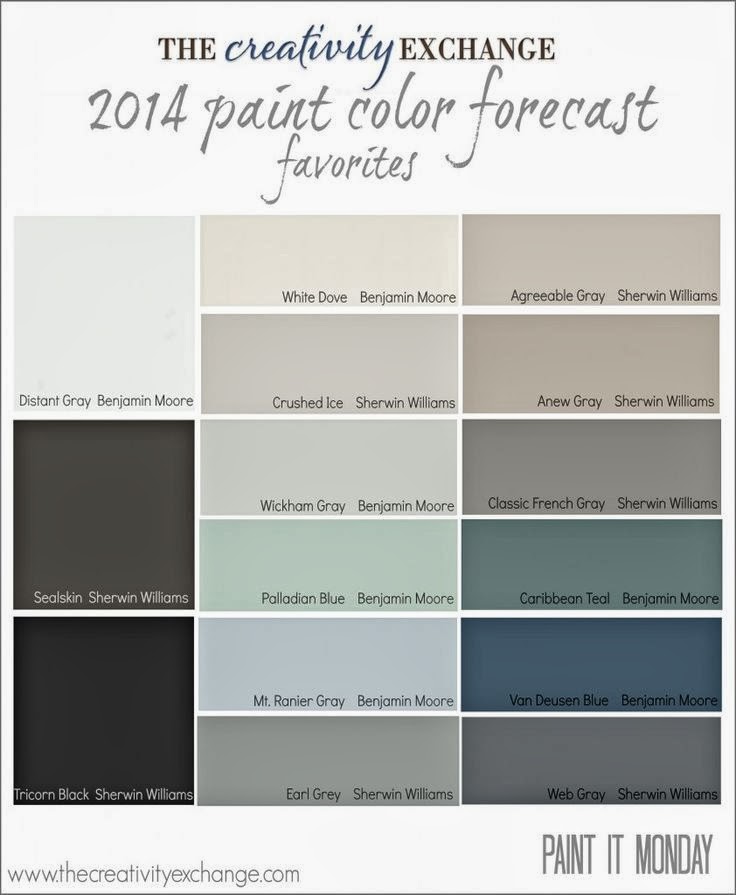
The director of color marketing for Sherwin-Williams, Jackie Jordan, explains in an article on  the DIY Network that "Stripes should be between four and twelve inches wide. A width of less than four inches becomes too narrow and busy, and more than twelve inches becomes too wide and heavy. However, if you have really tall ceilings or just want super, bold impact, make your stripes over twelve inches wide."

Using a leveler and coloured chalk, draw your lines on your walls according to your preference of direction and size. Now, tape to the outside left of each chalk line, using low tack painters tape. After that, you are ready to get painting. Once the paint has dried, you can remove the painters tape carefully and pulling it away from the wall on a 45 degree angle.

Now site back and enjoy your hard work!


Take Care,

Leanne.

Monday, April 14, 2014

Grey & Yellow Living Spaces

When renting or buying a new home, there's always the chance that you will not love the colour scheme chosen by the previous owners. This is exactly the predicament I am in with the new apartment that I will be moving into in a month; there are bright yellow walls throughout the space, and I am personally not a huge fan of yellow painted walls.

I have been wracking my brains for the last few days on what I will do to "fix" this issue I have; at first I was going to repaint the entire space, but now I have decided to work with what I have by keeping the existing yellow walls in the kitchen (since there is hardly any wall space there that isn't covered by a tile backsplash, and then painting 3 of the 4 walls in the open concept living room attached to the kitchen in a medium grey. In this way I will achieve a feeling of connection and continuity between the two spaces by linking the colours used in both rooms together.


The bathroom above shows how, when used sparingly, bright yellow walls can look quite nice. This is especially so, when pared with a grey wall.


Another way to tie the yellow in, is to make a pattern on the walls that will act as a decorative accent wall. I think I may do something like this, or stripes,  to keep the yellow to a minimum; less is more in my opinion when it comes to bright colours.


Take Care,

Leanne.


Wednesday, March 12, 2014

Painting With A Popcorn Ceiling

Recently I painted my apartment and found it very frustrating due to my popcorn ceilings; I couldn't get a straight line across the top of the walls due to the textured ceiling.
Go figure that I would come across some useful advice after the fact that I have finished painting, but I thought I would share it to keep anyone who is painting their home that has textured ceilings from experiencing the same frustration as I did.


Here's the simple trick: 
Before you paint, drag a narrow flat-head screwdriver lightly along the ceiling. You'll get a clean paint line and no one will ever notice that the bumps are missing.

That's it! Simple as that. No go ahead and paint without the annoyance that I experienced and learn from my mistakes. I can guarantee you that I will be using this trick from now on.


Take Care,

Leanne.

Friday, March 7, 2014

Shut The Front Door {Colour Psychology}

It has been said for a long time that the colours you choose for a room can establish a definite mood, which is predominantly determined through your paint choice. This is what is referred to as "colour psychology"; in short, colour psychology is the direct /indirect effect that colour can have on your mood.

You may have already been aware that your colour choices in your home establish a mood and set the tone for your home, but did you know that the same thing can be said for your front door?


That's right folks; the colour that you choose to paint your front door can immediately set the tone for the mood of your home before any one even sees the interior.

According to Intracoastal Realty's blog says regarding the colour choices you make for your front door, and what they say about you and what people can expect if your home based on your colour choice:

Blue: Rest Stop - Behind the blue door is an owner who thinks first of the home as a refuge: calm, serene, and relaxing, the perfect retreat from an often harsh and demanding world. 

Green: Peace Conservatory. Green connotes health, safety, tranquility, and harmony, all highly desirable attributes for the home environment. 

Black: Power Center. A black front door projects strength, sophistication, power, and authority, indicating to all who enter or even passersby that the home is a serious place inhabited by a person of substance. 

White: White is a classic color for doors, especially on a cottage style home. Throughout history, white has come to represent purity, serenity, and virtue. 

Red: A color with punch, red is vibrant, full of life, energy and excitement. Here's an exciting place to live. In Scotland, homeowners paint their front door red to signify they have paid off their mortgage. 

Purple: Purple is a pretty popular color for front doors. It's symbolizes energy and is thought to invite many opportunities into your home. Purple is universally known as the most spiritual and versatile color in the spectrum. 

Yellow: This color fosters mental sharpness and creates a sense of happiness and well-being. In Western cultures, yellow has contradicting meanings. On one hand, it denotes joy, happiness, imagination and hope. On the other hand, it symbolizes cowardice, jealousy and dishonesty. Depending on where you live, use yellow as a door color with caution. 

Brown: Painted or stained brown says "natural" and "organic" and feels warm, stable and reliable. However, darker shades can be foreboding, signaling a desire for privacy or isolation. 


Growing up in my parents' home, we had a mahogany painted front door (mahogany is a mixture of red and purple); if you read the descriptions for these colours red is energizing and exciting, while purple is spiritual and energizing. These characteristics are amazingly spot on for my parents home and also perfectly reflected both of their personalities. Now whether they realized these things at the time or not will remain a mystery to me, however, it's quite interesting how something as simple a s a front door paint colour can not only set a tone for your home, but can also reflect who the homeowners are as well.

What is your front door colour, and do you think it represents you and your home accurately? If not, maybe it's time for a change!


Take Care,

Leanne.

Tuesday, February 11, 2014

2014 Paint Colours

It's a new year, and with that comes new paint colour trends. With that being said, here are some of the predicted popular paint colours for 2014 from both the Sherwin Williams and Benjamin Moore paint lines.


Transitioning from the popular grays and taupes of 2013 comes a new cool colour palette with plenty of grays and blue hues. These muted tones are easy to coordinate with and give a sophisticated appeal to a room. 

My favourites are Sealskin (Sherwin Williams) and  Classic French Gray (Sherwin Williams). What are your favourites?


Take Care,

Leanne.

Friday, October 18, 2013

Sophisticated Halloween Decor

Halloween is a fun and playful time of the year, but sometimes the standard Halloween decor that stores sell are a bit too cheap looking for your sleek and sophisticated home décor.

The solution to your problem: pumpkins and craft stores.


This is a relatively cheap & easy way to decorate your home with pumpkins, and the greatest part is no mess required. All you need is paint (your choice of colours), some ribbon, and coloured mesh. Make it even more glamorous by using coloured glitter and glue to adhere it to the pumpkin (make sure your washed and dried the pumpkin for best results as paint adheres better to a clean surface).

Get creative, and make your festive pumpkins look beautiful and stylish.

Take Care,

Leanne.

Wednesday, October 2, 2013

It's A Boy! {Orange & Blue Nursery}

A few months ago I was hired on at my present place of employment as a Kitchen Designer to fill a maternity leave. I was lucky enough to be trained by the girl who's position I will now be taking over until her return, and this week officially commences her maternity leave. 

With that I was inspired by her soon to come bundle of joy, and thought that it would be appropriate to post a little something in her honour.


I love this nursery for a baby boy (it could work for a girl too, you just change up some accessories). The coordinating colour palette is great and refreshing. The colour psychology of the room is great too: orange is playful and joyous, and blue is calming and serene. In my opinion, and based on the aforementioned colour psychology, I think that these colours are perfect for a baby's room.

Having a baby is an exciting and joyful time. Have fun with making the baby's room a warm and welcoming space.

Congratulations to everyone who are expecting, or have had a new born!

Take Care,

Leanne.

Tuesday, September 3, 2013

Benjamin Moore Colours

I've been itching to paint my apartment for a while, but just hadn't found the colours to commit to...until now.

Introducing to you a wonderful cool neutral colour pallet from Benjamin Moore, Sherwin Williams, Pantone, and Behr paints:


In order from left to right:
1) Sea Haze (Benjamin Moore)
2) Mink (Sherwin Williams)
3) African Violet (Pantone)
4) Twilight (Behr)

This is such a beautiful colour combination. Whether you use all 4 of these colours in one room, or use them to transition from room to room, these colours transition flawlessly.

I cannot wait to paint! If you've painted your home in any of these colours please feel free to let me know how it turned out.

Take Care,

Leanne.